Client
Behavior Zoo
Role
UX/UI Designer
Duration
2 weeks
Year
2026
Executive Summary
Served as the sole designer on a 2-week engagement, working directly with the app's creator. Owned the audit, the design system, and a working coded prototype, then presented findings with prioritized recommendations for adopting the system and testing it with families.
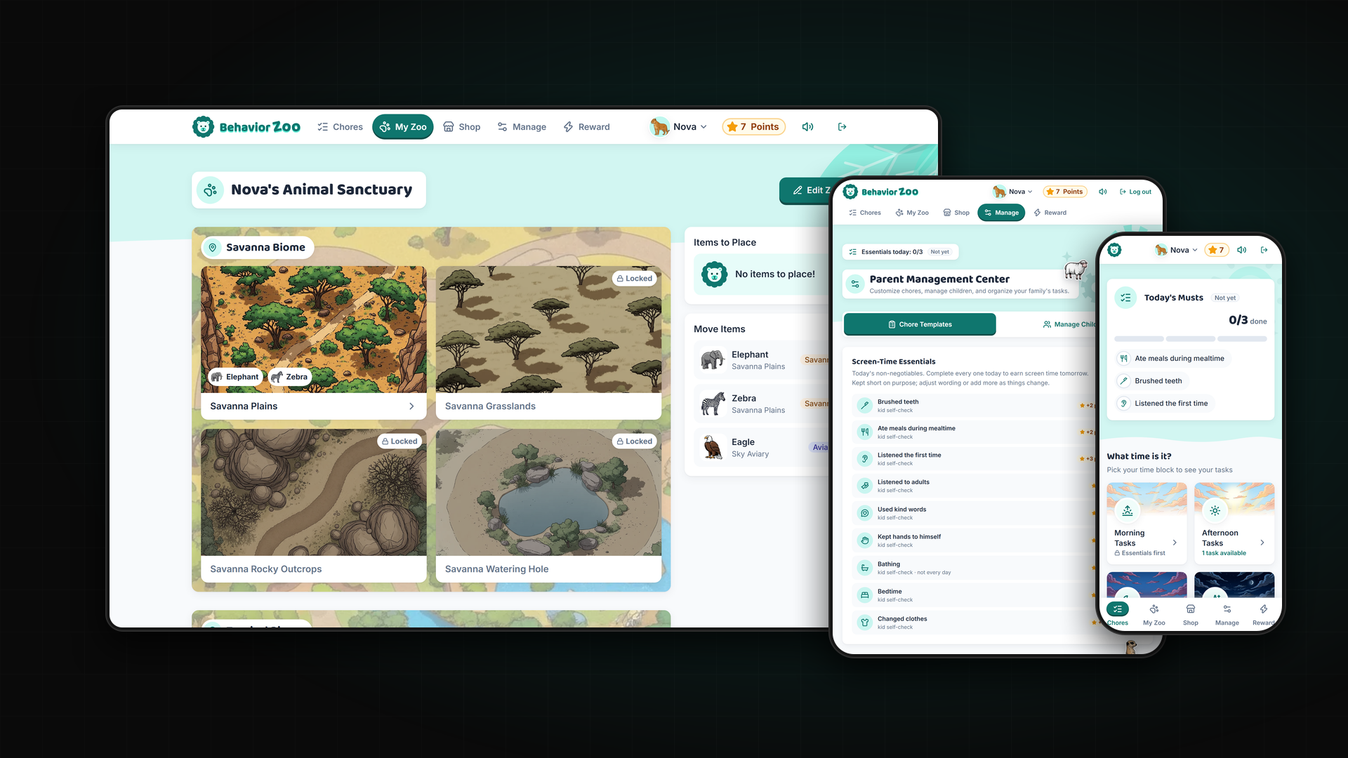
Behavior Zoo is a chores and rewards app for families. Kids complete daily tasks, earn points, and spend them on illustrated animals for their own zoo, while parents set up chores, manage children, and award bonus points. The app already had a strong core idea and charming artwork. This project was a UX audit of the live app, paired with a working prototype showing how its existing content and features could feel clearer and more consistent.
ONE APP, MANY STYLES
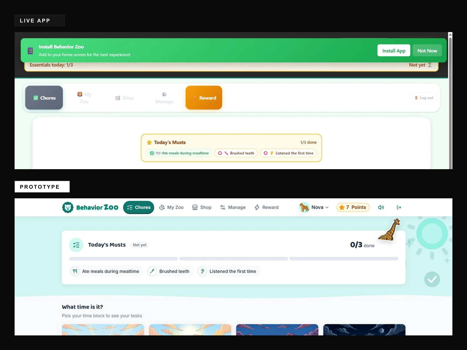
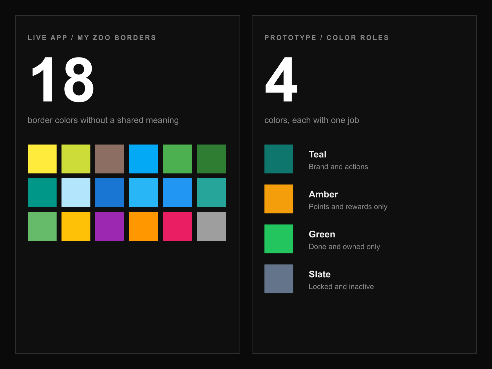
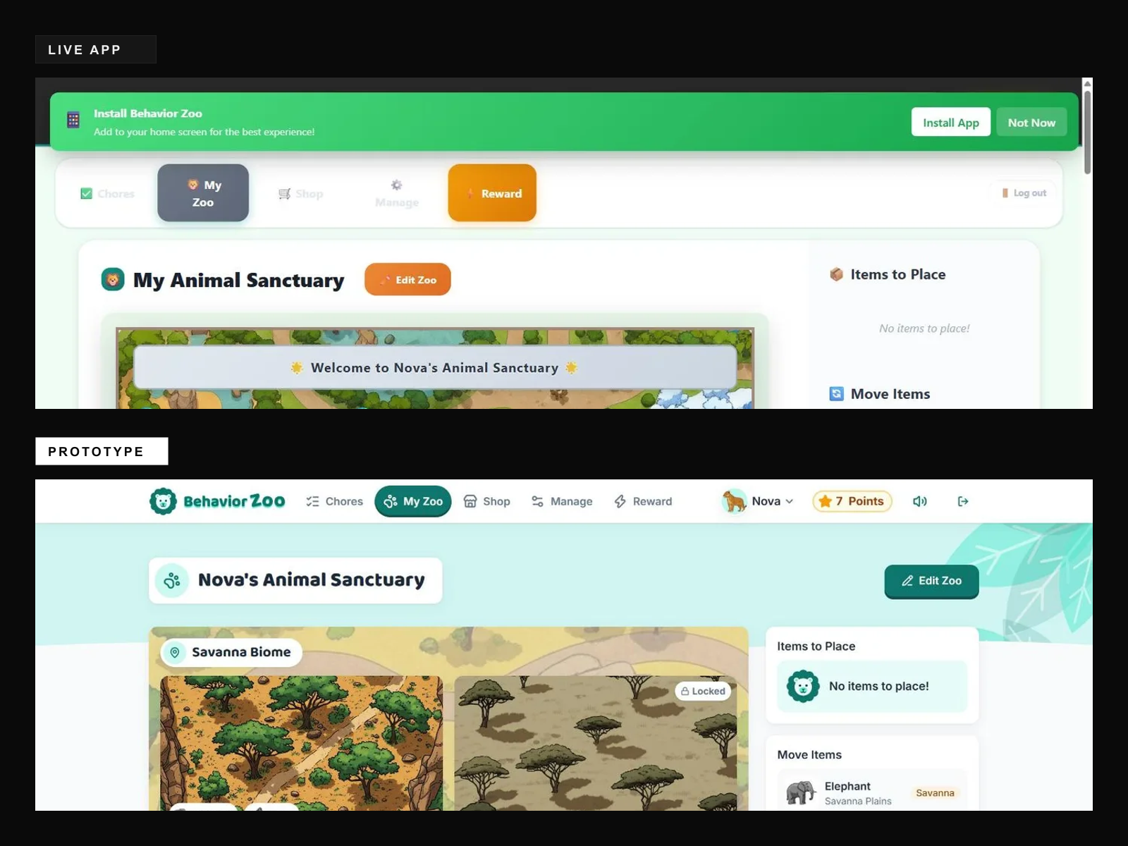
The app had grown screen by screen without a shared design system, so the same ideas looked different everywhere. My Zoo alone used 18 border colors without a shared meaning, emoji stood in for icons, the essentials count appeared twice on Chores, and a glowing Reward button drew more attention than the page you were on. On phones, the header stacked three layers. The challenge: keep every feature and piece of content, while making the whole app easy to read for early readers and busy parents alike.
DESIGN JOURNEY
Audit the Live App
Walked through every screen of the live app from both a child's and a parent's perspective, without changing any family data. Documented findings page by page across Login, My Zoo, Chores, Shop, and Manage, and measured patterns directly from the page, like the 18 border colors on My Zoo and the duplicated essentials status on Chores.
Build the Design System
Defined a compact system before touching any screens: four color roles (teal for actions, amber only for points, green only for done and owned, slate for locked), a friendly display and body type pairing, an 8px spacing scale, three button tiers, and one consistent icon set to replace emoji throughout the interface.
Prototype Every Screen
Rebuilt the full app as a working React prototype using the live app's real artwork and content: Chores, My Zoo with zoo editing and habitat detail, Shop, Manage, Quick Reward, and switching between children. Added the moments the app was missing, including celebrations when tasks are finished and an opt-in guided tour led by the mascot.
Design for Every Device
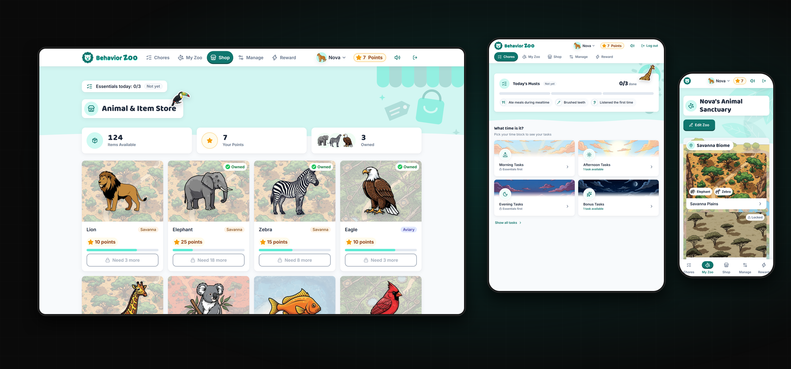
Families use whatever device is nearby, so every layout was designed for phones, tablets, and desktops in portrait and landscape: a bottom tab bar within thumb reach, a header that stays one row, shop cards that reflow into compact rows, and touch targets of at least 44px. Findings were delivered as a presentation alongside the prototype, with drag-to-compare views of the live app and the prototype.
ONE SYSTEM, EVERY SCREEN
A working prototype of the full app, rebuilt around one real design system so every screen feels familiar. Navigation uses calm, consistent states, each color carries a single meaning, illustrated time-of-day skies help early readers find their tasks, and parents get matching tools with inline confirmations instead of browser popups. It's paired with a presentation that walks through each finding and recommends next steps: adopting the system a screen at a time and testing the new design with real families.
THE RESULTS
Explore More Work
Back to Projects