Healthy, Personalized Recipes.
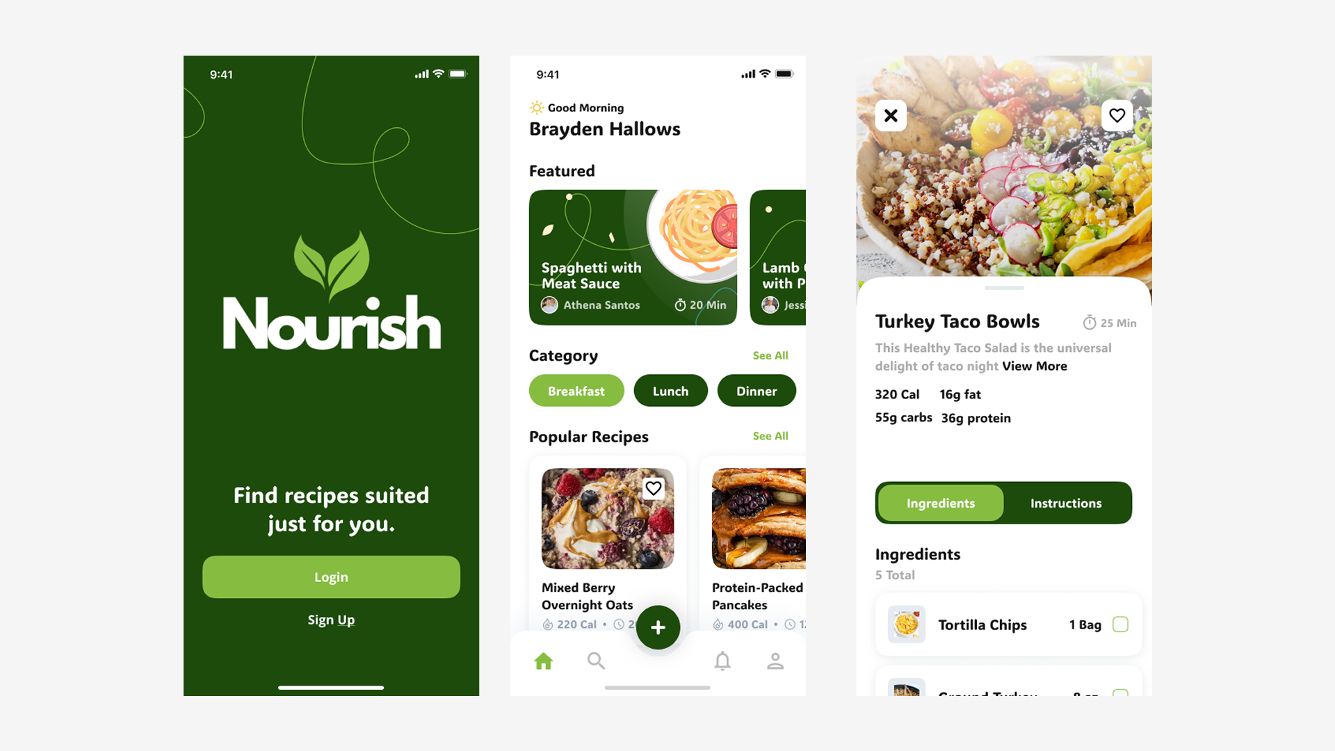
Nourish is a recipes app that was designed first and foremost for individuals with dietary restrictions. The objective was to design an app that accounted for a variety of user needs, including the ability to modify recipes with alternative ingredients based on their individual restrictions.
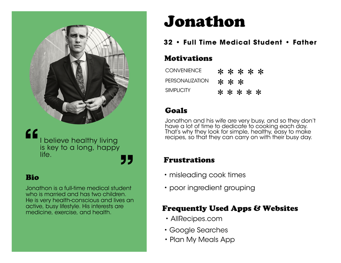
Our target audience were users who enjoyed cooking and spending time in the kitchen, but are limited by allergies, health concerns, or other dietary restrictions that affect the types of foods they can enjoy.
Understanding the User
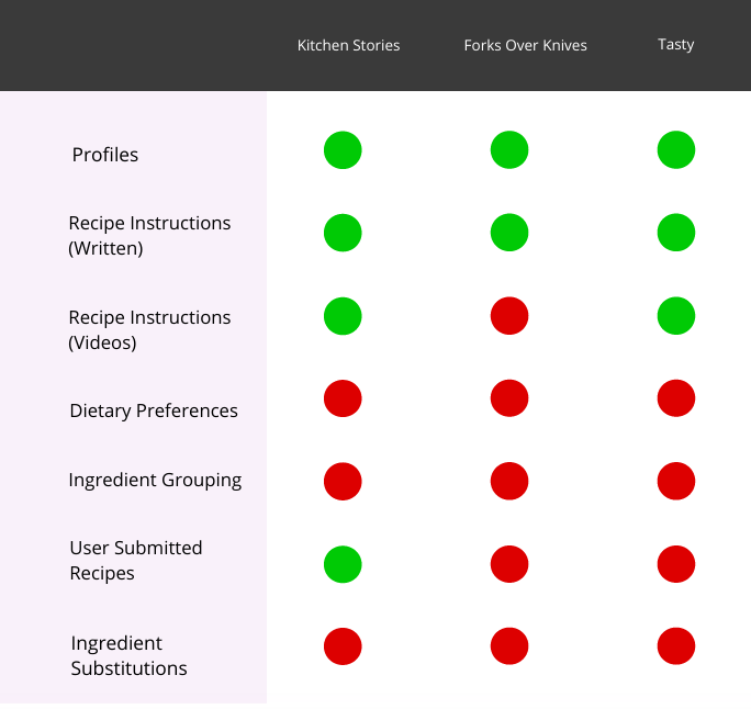
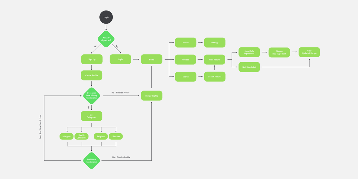
I began this project with an extensive user research phase, aiming to understand more about our target audience and what their wishes and pain-points are. To that end, I conducted an in-depth competitive analysis, several rounds of user interviews, and used those to craft my phase-one deliverables: user personas, a minimum viable product (MVP) checklist, and a comprehensive user-flow diagram.
My key findings helped to identify what features this product would need to be successful in a saturated recipes app market, and what pitfalls to avoid during the design process.
First-Draft Designs
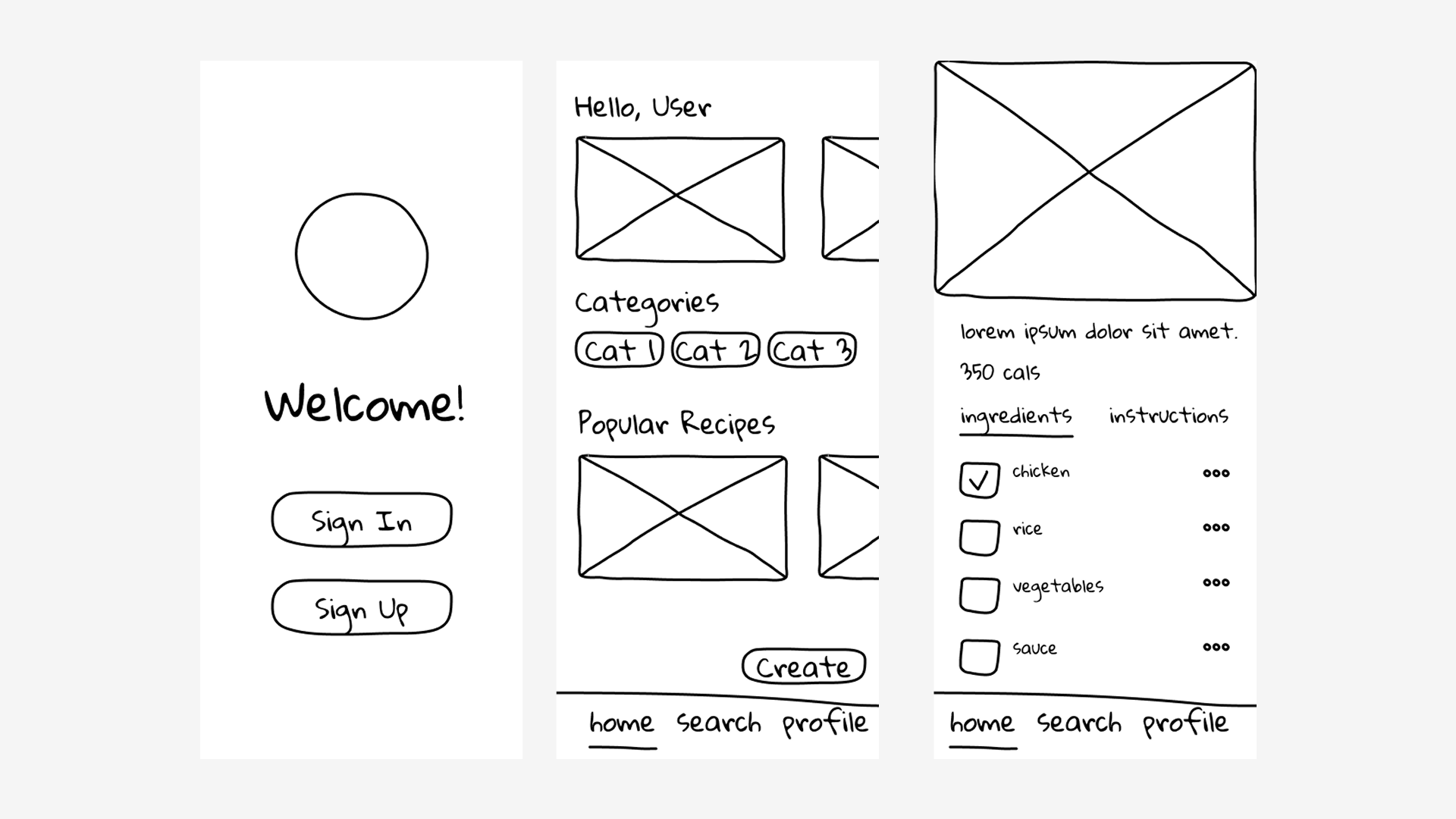
With my user research complete, I was able to use my key findings to begin sketching the low-fidelity wireframes of the mobile app. Working in low-fidelity allowed for quick brainstorming and testing of ideas with users and stakeholders, as well as ensuring that we could build a strong foundational layout and structure for the app to follow, before getting too focused on details like color scheme, iconography, etc.
Testing the low-fidelity wireframes revealed strong, intuitive navigation, but users struggled initially to substitute ingredients. By knowing the strengths and weaknesses of these early designs, I was able to take that into the mid-fidelity wireframes stage and refine the experience, doubling down on our strong navigation while refining the ingredient substitution functionality.
High-Fidelity Wireframes & Handoff
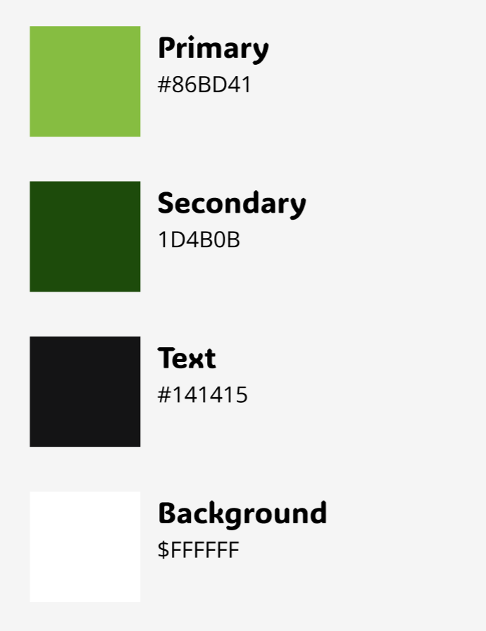
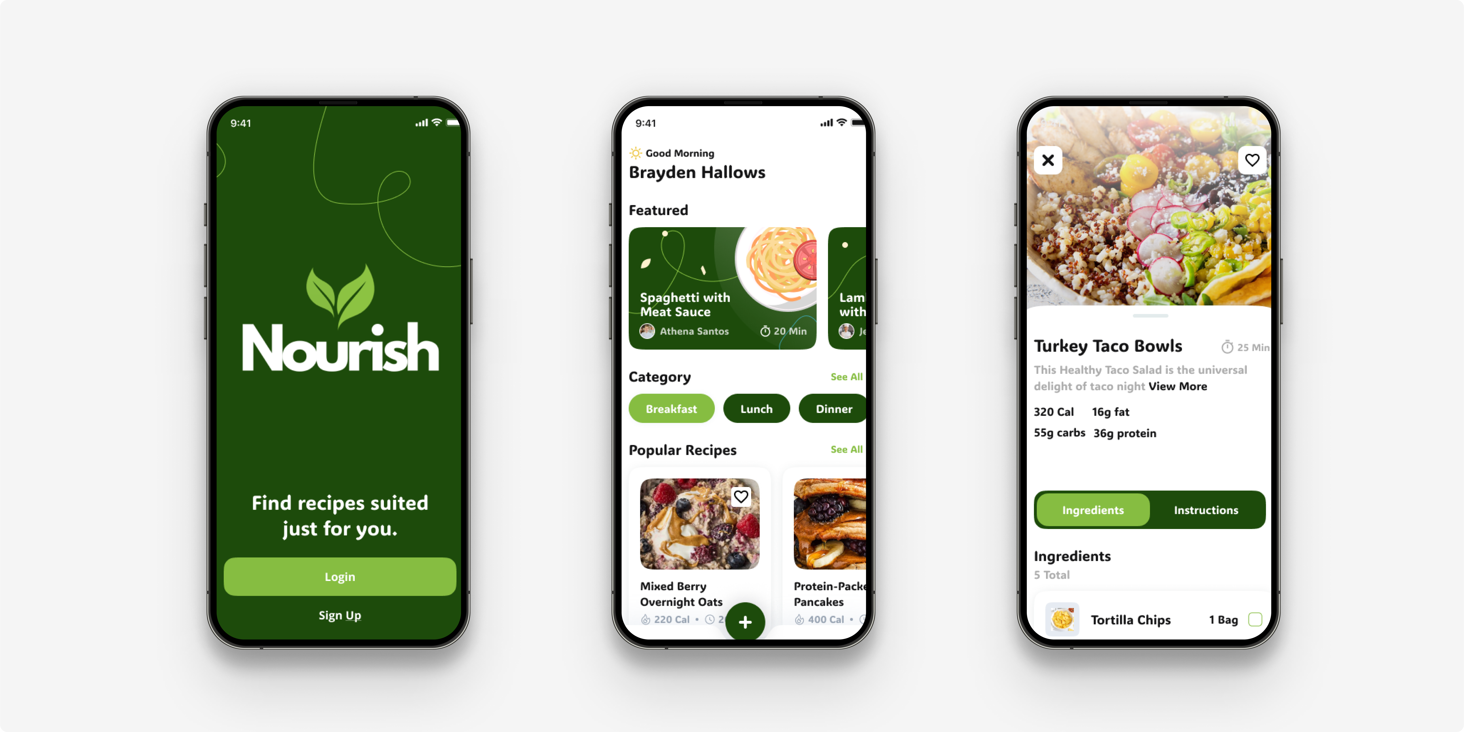
After another round of user testing using our mid-fidelity wireframes, we felt that Nourish was ready to move to the high-fidelity stage. First I created a style guide, using colors and fonts designed to evoke the right feelings and emotions within our users. From there, I refined the components library and created the high-fidelity screens following the user-flow diagram from earlier.
Once designs were tested one last time and approved, I was able to prepare the files for a smooth and seamless handoff to developers.
your project into a success story.
